


K2T FITNESS
OVERVIEW
K2T Fitness was founded by Kristine in March 2019 by Kristine to offer her services as a fitness personal trainer. However, she relies on word-of-mouth and Instagram to recruit new clients, which hasn’t helped her expand her business. Kristine desires to establish her online presence and offer her services to help women become a healthier, happier and more confident self.
Role: UX/UI Designer, Research, Interaction and Visual designer
Timeline: 4 weeks
Tools: Sketch, Illustrator, Invision
Team: Anita (Self), Alan Hurt (Design mentor), Other UX Designers (Group crits), Stephanie (Graphic Designer)
CHALLENGE
K2T Fitness needs a responsive website that evokes the values of the trainer while establishing the company branding to engage a wider customer base.
SOLUTION

A responsive website that is intuitive and displays relevant content critical in the decision making of the customer. While establishing the company branding, it allows new clients to discover more about the trainer, her programs and connect with her. It also provides a medium to schedule sessions for new or existing customers.
RESEARCH & ANALYSIS
What do I need to know?
After the initial kick-off meeting with the client, I sought to learn more about the fitness industry and the local competition. Most important question I had was -
What is the role, importance and expectation from this website? From the user’s and business’s perspective?
An interesting trend that I discovered was people are looking for holistic solution and prefer a combination of exercise, diet regulation and mindfulness for improvement in overall health. At this point, I discussed this with the client who agreed it would be a good idea to include it as part of her services as she was already certified in Nutritional services.
How can we outperform the local competition?
Conducting competitive analysis with some local direct and indirect competitors by analyzing their websites, social media accounts helped me evaluate their strengths, weaknesses and other patterns. This juxtaposition allowed me to make informed decisions on the features and services necessary for the local market
Understanding existing and potential new customers
In order to derive the needs from actual users, I conducted user interviews that were structured around collecting information on their discovery of the business and experiences with the trainer in person and online. The group consisted of 6 women - both direct clients and non-clients.
The key insights derived from the user interviews -

Users need to know about the personal trainer - personality, success stories etc
Existing users want to have a convenient and reliable scheduling system
Users want to receive nutritional advice in addition to workouts
Personifying the User
Enters ‘Megan’, who represents the characteristics of majority of the target audience lacking self-motivation but have a desire to stay fit and will be used as a benchmark to check that my designs offer relevant solutions.
DEFINE
Converging business and user goals
I met with the client and re-evaluated the business goals, took into consideration the user goals to make sure I design for both.
Framing the problem as opportunities
In order to generate multiple ideas for the problems at hand so as to pick the “best”, I reframed the problem we are trying to solve into POV from which I derived the following HMW statements.
HOW MIGHT WE…
How Might we make it easy for Megan to learn about the personal trainer?
How might we help Megan coordinate her sessions conveniently with the trainer ?
How might we help Megan discover nutritional information offered by the trainer?
The trickiest feature was how to handle (re)scheduling for the clients with least confusion and tracking involved. Taking into account the client’s reluctance on paying for any additional software, I researched and discovered a couple of free scheduling softwares which I could integrate into the site and leverage their features. We settled on 'Timetap’ as it would suffice the needs of the client and customers without much hassle.
IDEATE & PROTOTYPE
Optimal organization of content
Having identified the key features I would incorporate into the design, I then focused on constructing a sitemap to visually represent how best the content could be structured for users to intuitively navigate the website.
Sketching
Deriving the learnings from the interaction design flows, I hand-sketched concepts for web pages - Home, about the trainer, service information, how to contact the trainer and nutritional advice - before digitally sketching the wireframes. I also drew inspiration from other personal trainer websites and studied existing patterns that make for a more intuitive user experience. I engaged the client at this stage and she provided some constructive feedback especially about the service details.
Mid Fidelity Wireframes
In order to build on and test early prior to adding the UI details, I created wireframes with greyscale color palette. These served as the blueprint for K2T Fitness and helped me focus on the visual hierarchy and interactions within the site before designing in color. A prototype was created to measure the effectiveness/usability of the product design. I also made the wireframes for various screen sizes.
TEST & ITERATE
What do Users think of the design?
In order to cover the entire spectrum of audience for this website, I recruited a total of 6 females consisting of the existing clients and random people interested in fitness as my test subjects. Tasks I tested for are -
Find information about the trainer, the training options and prices this trainer has to offer
Identify how this trainer shares her knowledge related to fitness and nutrition
Identify where they would look for any free or reduced initial consultation with the trainer
Identify how they would book the consultation session
Outcome of Usability Tests
Contrary to my expectation of 95% error free rate, though participants completed all tasks, only 63% participants completed with no errors. I synthesized the results using an Affinity map and gathered some insights which I iterated in the mid fidelity wireframes.

Style Guide
In order to bring the mid-fidelity wireframes to life, I created a brand style tile that is cohesive and consistent with the K2T Fitness’s branding direction and current trends. It will will serve as a reference guide for any future work and will be handed over to the developer. I first identified the brand attributes for K2T Fitness which drove the selection of the UI elements -
Modern, Bold, Powerful, Sophisticated, Positive, Friendly

High Fidelity Wireframes + Prototype
Finally, based off my mood board for the colors and imagery, I applied the branding and styling to the wireframes in Sketch, with few modifications, and made an updated prototype. I then presented the designs to my client who approved the branding and suggested few changes to the content.
I adopted the ‘fail fast, fail quick’ philosophy and went for 2 rounds of usability tests and received very useful feedback.
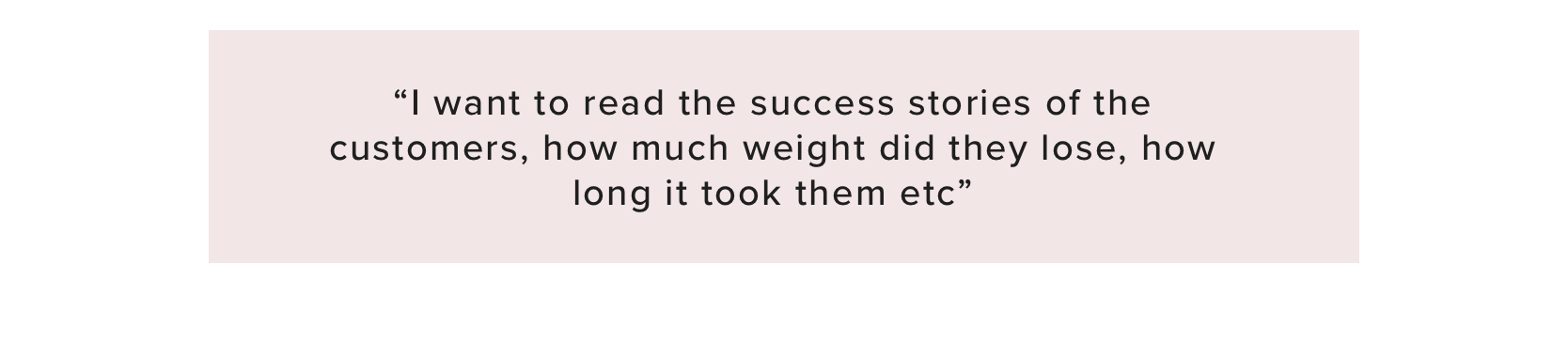
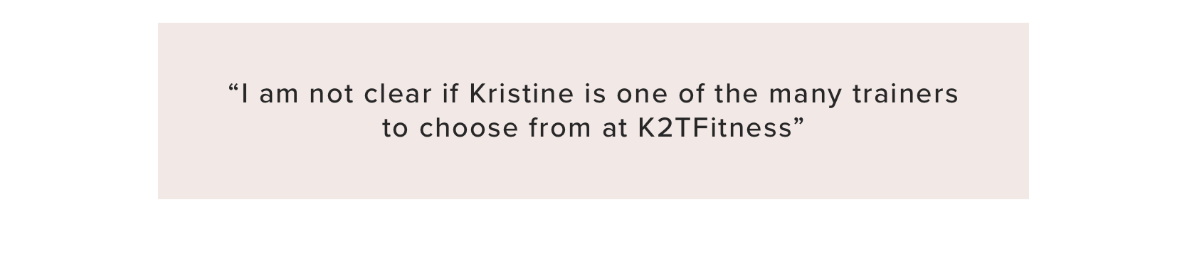
Participant comments:

Below are the screens designed for the website
REFLECTION
I was able to utilize my previous experience as a Project Manager to ensure a smooth execution of this project. I created a plan using Trello board to keep track of the timelines, tasks and shared the same with the client. Working closely with her since conception was a fantastic way to streamline design impact and gather buy-in. It maximized the design effectiveness and led to a happy client at the end of it and an overall, rewarding experience.
If I were to pick the most critical phase in this project, I would choose Usability Testing. The feedback from real users is invaluable and makes all the difference between a good usable and good but unusable product. And for that, I had to step out of my comfort zone to seek strangers that fit the persona and are willing to test my product.
I however did not get the opportunity to work directly with the developer for this project. So post designlab project timelines, I created a developer hand-off document and handed it over to the client.
Update:
The client launched her website in Jan 2020. Some stats - In the past 11 months since the launch of her business she had 3 clients but since she launched her website, she gathered 7 new clients in a matter of 8 months. The results so far are showing that the website is helping her promote her business as intended.
CLIENT FEEDBACK
“
By the time I met Anita, she had done her research about small scale personal trainers like me. I gave her some ideas on what I wanted and she knew when to say "no"....and she was right. How she (re)wrote the content throughout the site was incredibly thoughtful and she made sure it was marketable to the target audience.
I was also very pleased with the visual design aspect. She listened to the type of style that I like, and she delivered. At the end, Anita took the extra step to create a document so I could easily pass the designs to the developer.
I highly recommend Anita for website design. She's detail oriented, actually listens to the client but at the same time ensures customers find what they need. She really cares about her work!