

SHIFTO
DESIGN CHALLENGE
This virtual design challenge was hosted by UX Wizards South bay. The focus for this challenge was to design a product helping people relocate to a new city or country.
Role: UX Researcher | Interaction and Visual designer | Team Lead
Timeline: 1 week(Design challenge) plus 1 week (post challenge)
Tools: Figma, Adobe Illustrator, Google Form, Mural
Team: Anita Grandhi, Victoria Chang, Bermond Yange, Jaden Mixon
PROBLEM
In light of the current events, global pandemic is making companies rethink their working policies. As employees around the world are adjusting to working remotely, some people begin reconsidering living in high-density cities, where both rent and the cost of living is extremely high. We need a digital solution to help working people relocate with minimal disruption.
SOLUTION
Shifto is an iOS mobile app that helps users plan their move by recommending a list of moving tasks largely driven by their on-boarding process responses. This app also suggests local services in order to complete some tasks, providing 1 easy platform for the user to manage and track most of the tasks.
RESEARCH & DISCOVERY
What do we need to know?
After the team got together and discussed the logistics and tasks to do in order to come up with a solution, we dived deep into understanding the problem space.
To guide our research, we put together a list of questions with the most important ones being -
What are the driving factors for people to shift?
What current tools do people use when deciding or have decided to move?
How does it work for them?
What are their concerns, frustrations and compromises as they move or decide where to move?
What are the economics associated with relocation?
As we had a very restrictive time, we decided to gather insights by doing some market research and by conducting facilitated brainstorming within the team. However, in the end we employed different techniques in a bid to understand the user and their challenges.

Using Mural for remote collaboration, we made an affinity map with our initial finds from market research and brainstorming.
Key Takeaways
Job Related

Concerns about market value - People fear missing out on innovation and growth opportunities at work if they go remote.
Job Risk - Companies may not consider paying the same pay package or look at hiring anyone as employee location is no longer a constraint
Adapting to new Community

Cultural fit - People evaluate various factors like culture of new place, transportation, weather, open spaces especially those with pets while deciding on a place to live
Finding friends and services, utilities
Moving Costs

Expensive - People consider moving to be an expensive and cumbersome task and prefer to get company relocation charges
Timing - People time their moving with their lease end or sale of a house, schools opening etc
Family Considerations

Job - Partners finding a satisfactory job may prove to be challenging
Schools - The new place needs to have good schools for families with kids
Childcare - Childcare facilities are quintessential for families with young kids
Resources

Professional services - 63.9% people prefer to move on their own versus hiring professional movers
Company relocation charges - 26.4% of companies provide some assistance with relocation like sponsoring trips to find new home, temporary housing, providing MEA
Understanding our target audience
Surveys
Our initial research showed a myriad of problem areas that are associated with moving but did not answer most of our initial questions that were part of our research goal, so we conducted surveys and sent it out within our networks.

General Insights
The top 2 reasons to move were affordable housing (62.5%) and job opportunities (53.1%).
Roughly 25% of the 32 people surveyed stated they planned the whole moving process on their own while the 60.5% people employed local moving companies to help with their move.
75% preferred to work from home when doing a remote job while the rest was split evenly between co-working space, office space, cafe and library.
We realized that our approach to solve this challenge didn’t yield any patterns or delve deep into understanding the pain points associated with moving for which we could start brainstorming solutions for. Our survey questions were too broad and also sent to an audience with varied experience in moving, not necessarily for work.
But 1 finding from the survey showed that irrespective of how people shifted, everyone planned in advance and used different platforms to help with their planning. We wanted to explore how people used these digital services to assist them.
So even it weren’t part of our plan initially, we proceeded to conduct user interviews.

User Interviews
We identified 4 people within our networks who moved for work and interviewed them about their process.
Comments from interviews
Personifying the User
Synthesizing all the findings so far, we created our persona “John” who represents our target audience. I created a matrix of his goals, frustrations etc to guide us in our design.
DEFINE
Problem as an Opportunity
As a final step before jumping into the solution phase, we revisited our research findings derived from all techniques used and put together HMW questions to assist us in brainstorming.
HOW MIGHT WE…
How might we help John to identify all tasks to be done prior to the move?
How might we help John find people sharing similar culture and ideas in the new place?
How might we help John find affordable housing that suits his needs in a new city?
A time-boxed brainstorming on Mural yielded some possible solutions but considering the available time and magnitude of the problem, we chose 1 HMW by dot voting.
How might we help John to identify all tasks to be done prior to the move?
Journey Map
To visualize better how our solution fits the overall goal of the user, we quickly sketched a user journey map and then moved to identifying features we want to design. We concluded a mobile app is the best solution as John would need access to the tasks at all times - at home, at work or elsewhere - and there is widespread research to show the popularity of a smart phone.
IDEATE & PROTOTYPE
What features should the app contain?
We brainstormed the following features and created a prioritization matrix as below. We picked these squares because they fulfilled the user’s needs, required the lowest effort given the time constraints, and had the highest impact for the user.
Sketching
Each of us decided to ideate on their own like in a design sprint to have a range of possible solutions. Taking inspiration from various apps related to checklist, moving and others, I made sketches to display the content, structure and layout and also leveraged user’s familiarity with design patterns.
DESIGN CHALLENGE SCREENS
We had a week to create a solution that addressed the challenge objectives. Over the course of our research, we found that the factors influencing a move for reasons other than work are not very different. So we designed for a broad target audience within the constraints of the design challenge.
The main flow of our design was to onboard the user with a set of key questions that allows for a list of common tasks to be pre-populated.
Timeline of tasks - A chronological sequence of events along a draw line, to visually depict all the tasks to be done prior and during moving.
Smart recommendations - The app will make suggestions on the activities to be performed based on the information provided. For example moving out of state may require change in car insurance.
Main design consideration - Avoid cognitive overload and build trust. So the initial on-boarding covers the basics for which high level tasks can be suggested and more information is prompted when required which in turn may trigger other subtasks
FEEDBACK FROM JUDGES
Strengths
Strong research that shows the progression and backs up the design decisions
A visually appealing design that maintains a cohesive branding through out
The timeline feature which makes it convenient for the user to get a complete list of tasks and their status at a glance
Areas of Improvement
Make it clear if the tasks are auto generated or added manually.
Flush out the interactions between the screens
TEST & ITERATE
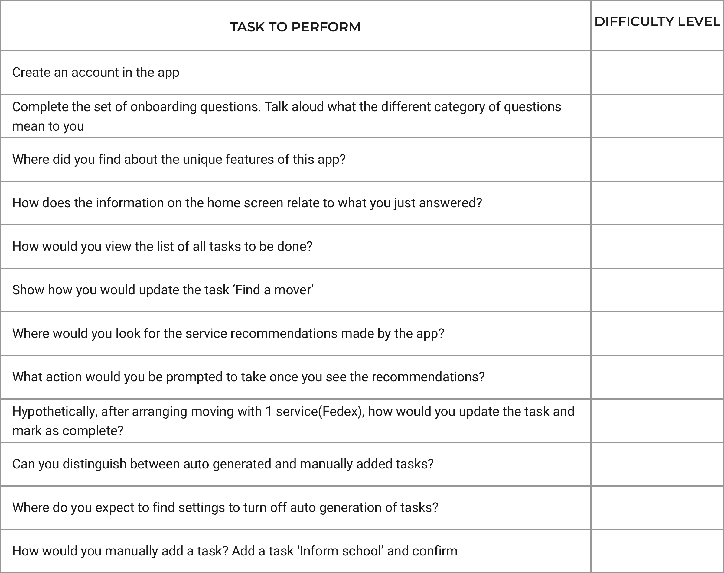
Post the design challenge, taking the feedback from the judges and other panelists, I continued work on this and developed a few more screens to improve the overall usability and efficiency of the product.
I also conducted socially distant/remote usability tests with few participants and gathered the difficulty rating to understand how well the design was executed to solve the user’s problem.

FINAL PROTOTYPE AND DESIGN INSIGHTS
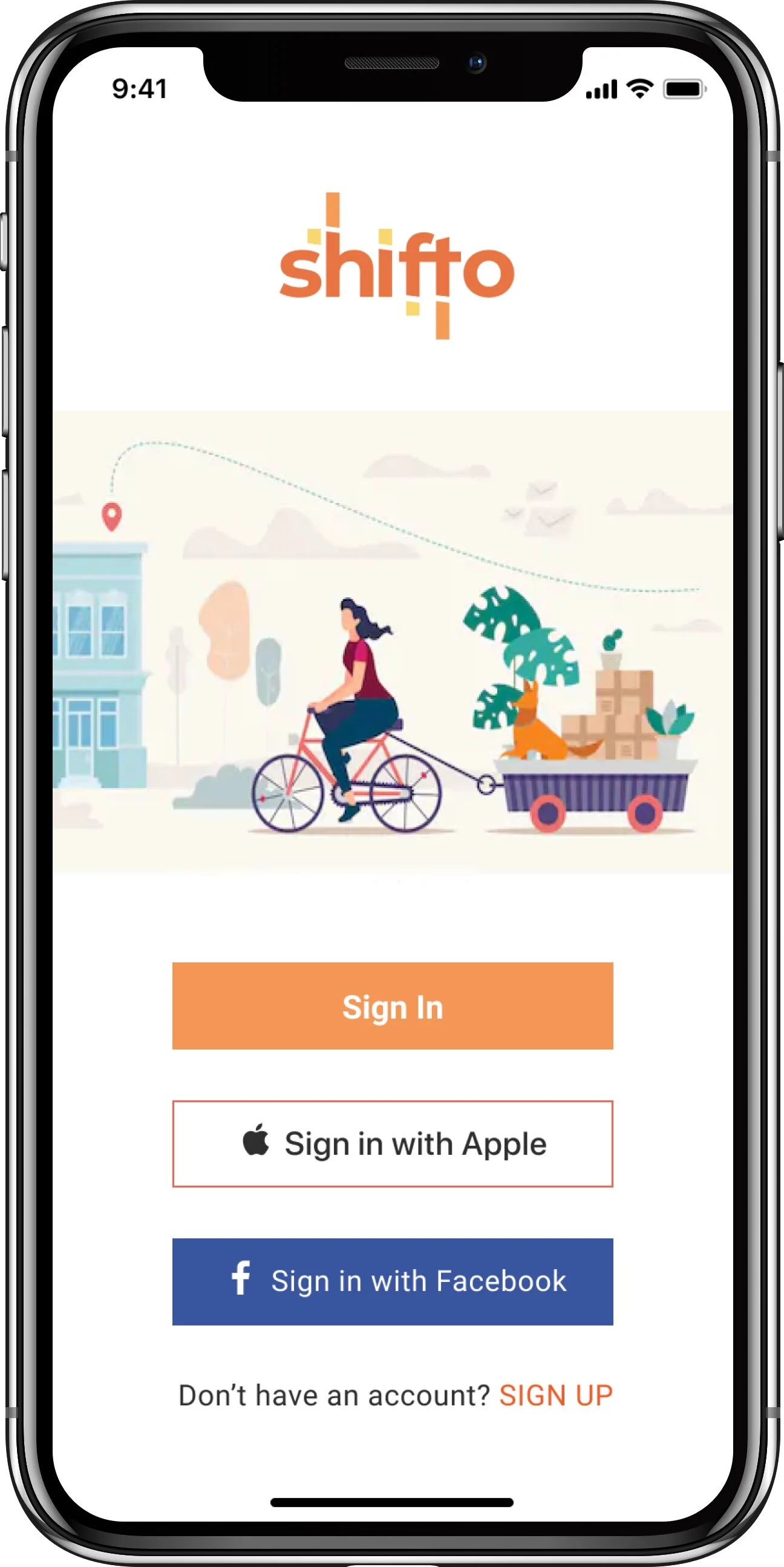
Onboarding questionnaire
Once the user has signed up, they are taken through a series of short questions divided by 3 main categories. These responses help the app recommend some common tasks associated with moving but custom to the user. This primary and unique feature intends to eliminate some stress for the user by reducing their workload. Also, these tasks prompts additional related tasks.
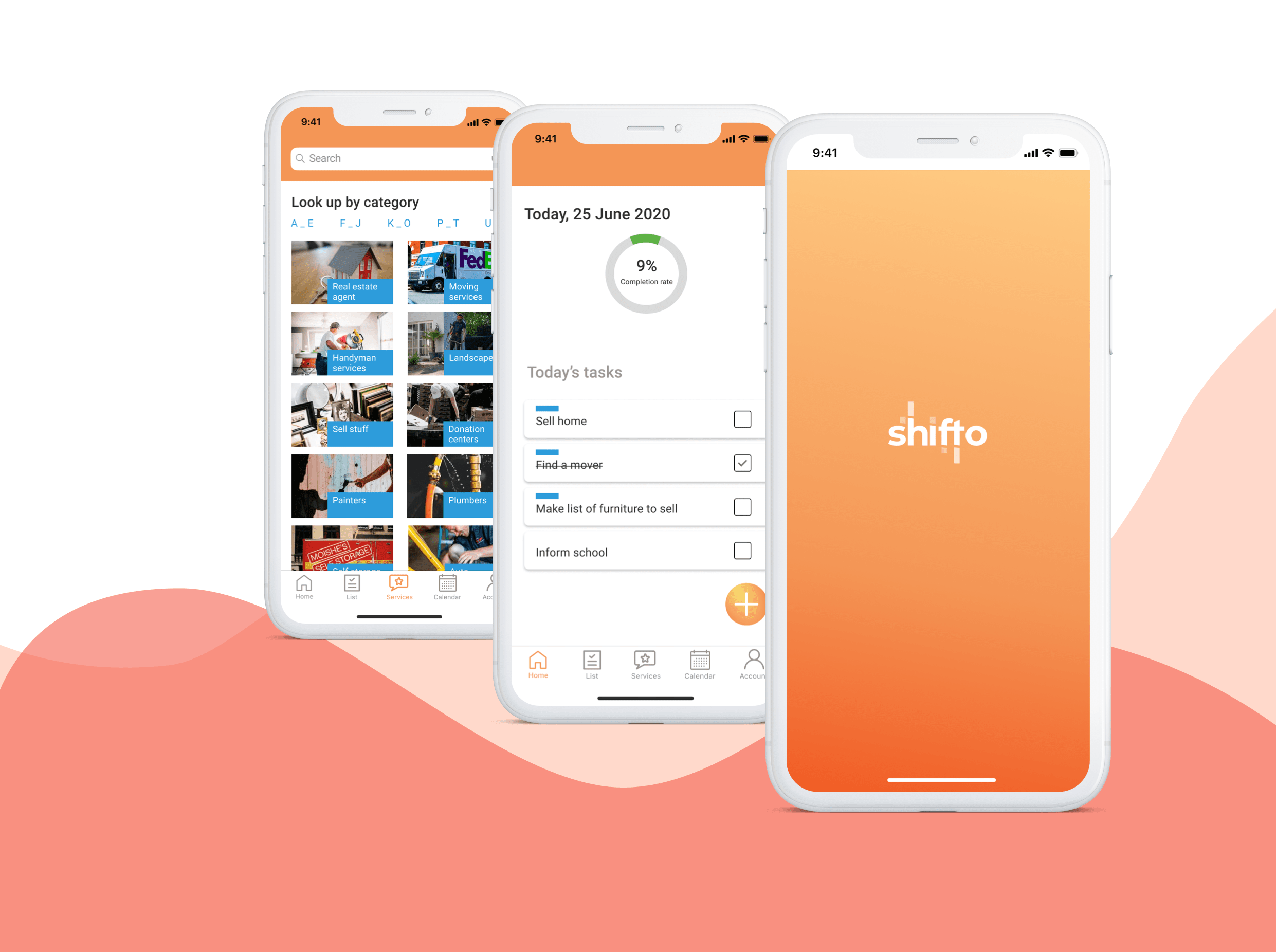
Home - Task dashboard
The Home screen shows the overall progress of tasks completed plus the tasks(recommended plus manual) due for that day. This helps the user tackle the tasks in a planned manner and be more efficient. A progress indicator will motivate the user and help in giving an overall sense of where they stand. Help tips for a 1st time user is provided via the banner and users have the option to use this app as a regular Task list app, if desired.
Lists in timeline
All tasks are split into 3 categories based on the purpose they serve and presented in a timeline fashion, with control to manipulate them. This format was well liked by judges and users as it helps with better time management and be on track, promotes better react and response time.
Individual task details
The individual task details screen provides any and all information related to the task as inputted by the user. It also allows for subtasks to be created. The main highlight is the list of relevant service recommendations that the app makes. This assists the user in exploring options for them to complete the task from the same platform, saving time and reducing stress.
Onboarding on need basis
Questions are prompted to the user at different points of using the app, which in term will drive the auto-generation of more tasks. This reduces the cognitive load on the user and doesn’t overwhelm them in the start which may otherwise encourage them to abandon the onboarding questionnaire and miss taking advantage of the main feature of the app.
Services recommendation
A list of common services that are useful for moving recommended by the app. They are listed in a separate screen for easy discoverability. The user can look up for them by a powerful search option, by just scrolling or by utilizing the filters. Giving multiple ways helps cater for different type of users.
REFLECTION
Working in a team with designers of different level of experience, I learnt a lot about collaboration, prioritization and time management. Also, as the team lead, I was able to work on creating the plan, identifying the design tasks crucial to our project, and splitting the work based on the team members skill set.
Our focus for the challenge was addressing the core problem for the user and designing cohesive visuals for those few screens given the time crunch we were on. However, post the challenge, I was more strategic and could produce designs which were more usable and focused on user-centered UX decisions.
Some takeaways -
Design sprints work well for projects of such short duration and adherence to it will enable the team to develop a good solution that can be tested
Speaking with a real user is essential as early as possible. Talking to the wrong user can easily mislead the entire design process.
It is important to have a feature prioritization list for all team members to agree upon and have a common understanding before proceeding to the UI design
NEXT STEPS
Conduct more rounds of usability testing and refine the features
Iterate on designs based on synthesized feedback and update UI kit accordingly
Explore the development feasibility of services/APIs to incorporate the smart recommendations into the app