


WASTEMENOT
OVERVIEW
Despite the best intentions, we loose track of perishable food at home and end up throwing away expired or spoilt food. This results in significant food waste.
WastemeNot is a concept iOS app to reduce food waste by empowering users with information about the food inventory at home and offering various possibilities with it.
Role: UX Research | UX & UI Design | iOS | Branding
Timeline: 4 weeks
Tools: Sketch, Adobe XD
Team: Anita (Self), Alan Hurt (Design mentor), Other UX Designers (Group crits)
PROBLEM
There are multiple food apps on the marketplace, each typically serving an individual function. For example, some maintain food inventory, some create a shopping list, and others provide recipes. When your goal is to reduce or eliminate "food waste" at home, there simply isn't an all encompassing solution. Because of this, users would be required to juggle multiple applications which becomes tedious, frustrating, time consuming, and ultimately not worth the effort.
SOLUTION

WastemeNot is an iOS app that provides a platform where users easily create an inventory of their food at home which then informs their shopping lists. It also recommends options on how to use the resources available at hand by suggesting recipes and enables sharing the surplus with others in the community.
RESEARCH & ANALYSIS
What do I need to know?
In order to understand the problem space, I had to understand the magnitude of this problem outside of my own home and the reasons behind it. I began with the following questions -
What are the food shopping trends and behaviors of users?
How do users manage food at home, what are their goals and frustrations?
How aware are the user’s about the impact of their food habits and what is their willingness to adopt sustainable practices?
What solutions exists in the market today and how do they measure?
Understanding the competition
In order to set the bar for my design, I studied the apps of the following competitors:
What Works
All had an easy on-boarding process
Recommendation were provided to user based on their behavior
Simple to use interface
List updates could be done in multiple ways
User receive alerts for expiring foods
1-click actions made it easy to update
What does not work
No auto prompts were available
1 action required multiple clicks
No sync option between devices
Ingredients did not have expiry dates
Suggestions were not customized for user
No indication of low inventory
Understanding our target audience
Surveys
For this project, I conducted a survey with some participants. The survey questions covered topics like: food management, shopping habits, and how they felt about sharing food with others.

General Insights
74.07% throw food since they forgot about it whereas 22.22% throw it as they have excess and do not want to eat it
62.96% are concerned about food safety while sharing with strangers
Only 11.11% maintain a grocery list
The survey results challenged an initial assumption that most users maintain a shopping list. And it confirmed another assumption which I made initially related to the general wariness a user may have about sharing food. I proceeded to validate them further in my user interviews.
User Interviews
Taking into account the time available for this project, I opted to interview 6 females who cook regularly and belong to diverse ethnicity, different demographics (married, unmarried, with kids and no kids). We discussed grocery shopping and cooking habits within the unique lens of food shelf life.
Comments from interviews
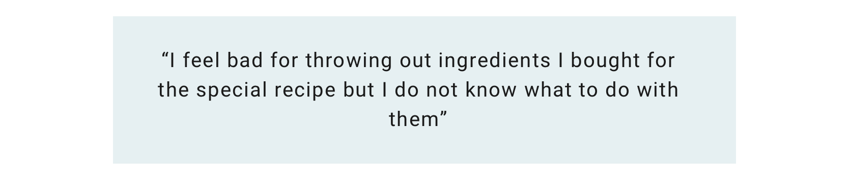
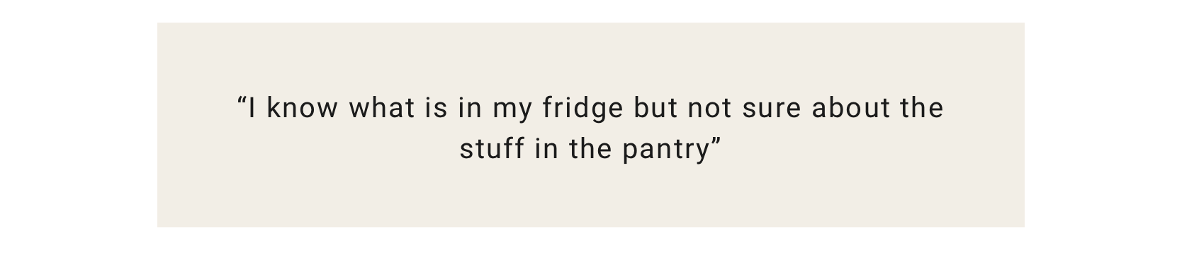
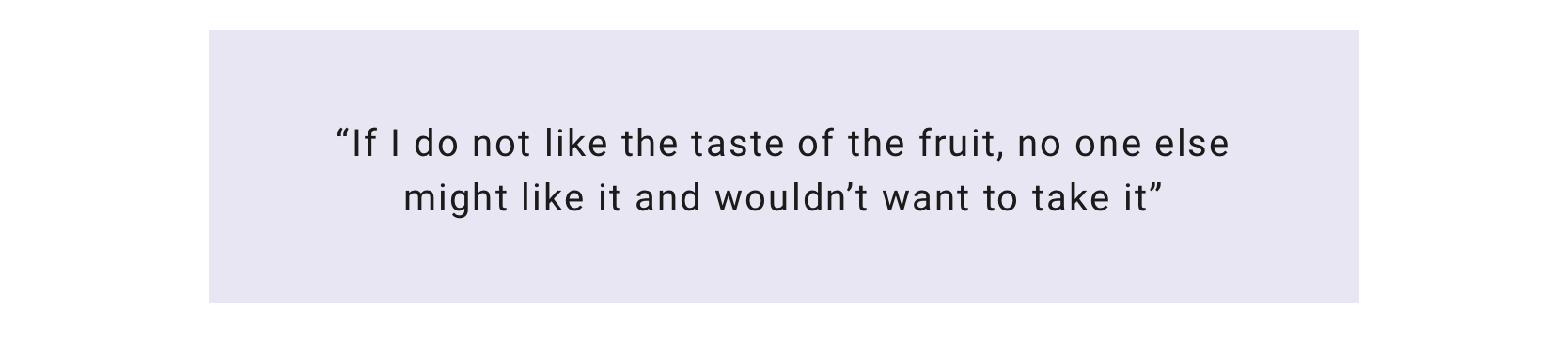
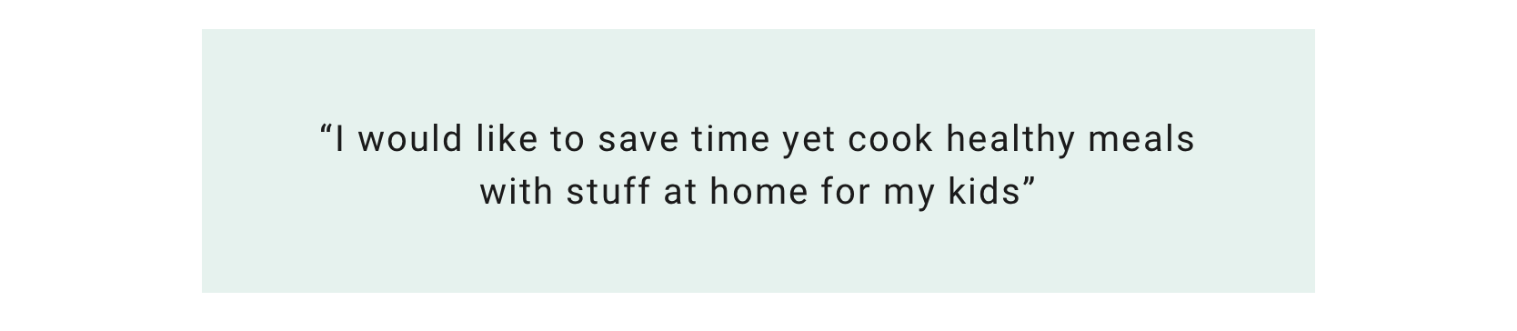
After having in depth conversations, it really helped me crystalize my ideas and further validated the need for the WasteMeNot app.
Personifying the User
Synthesizing the user interview findings using an Empathy map, I brought in Sara who represents everything the target audience is - Conscious about wasting food, organized, busy parent and socially responsible. I created a matrix of her goals, frustrations etc to guide me in my design.
DEFINE
Problem as an Opportunity
The goals were diverse and had to be addressed from different angles. This was achieved by 1st converting the user needs into POV which led to HMW questions that assisted me in brainstorming.
HOW MIGHT WE…
How might we make it convenient for Sara to be aware of food at home?
How might we assist Sara in finding quick and easy recipes to cook ?
How might we help Sara feel comfortable and about sharing food?
IDEATE & PROTOTYPE
What features should the app contain?
Starting from the HMW questions, I brainstormed in short sprints. As this was an entirely new app trying to solve 1 big problem there were a lot of features that need to be built but given the time constraint, I worked on prioritizing them for the MVP using the RICE product management method. As I could not estimate the Reach and Impact accurately, I only assigned Confidence and Effort for each feature.
View the full Feature Roadmap here on Airtable

Optimal organization of content a.k.a Information Architecture
With the features selected, I created a site map to ensure the navigation would be intuitive to users.
Determine the interactions between screens
In order to better understand the various ways users could potentially navigate and use the app, I mapped out 3 individual user flows with our persona, Sara, referring back to the information I gathered from the user interviews during research. Breaking down each flow into sequential steps helped inform the relationship between each screen and how to best optimize discoverability for each.
View the entire flow here.
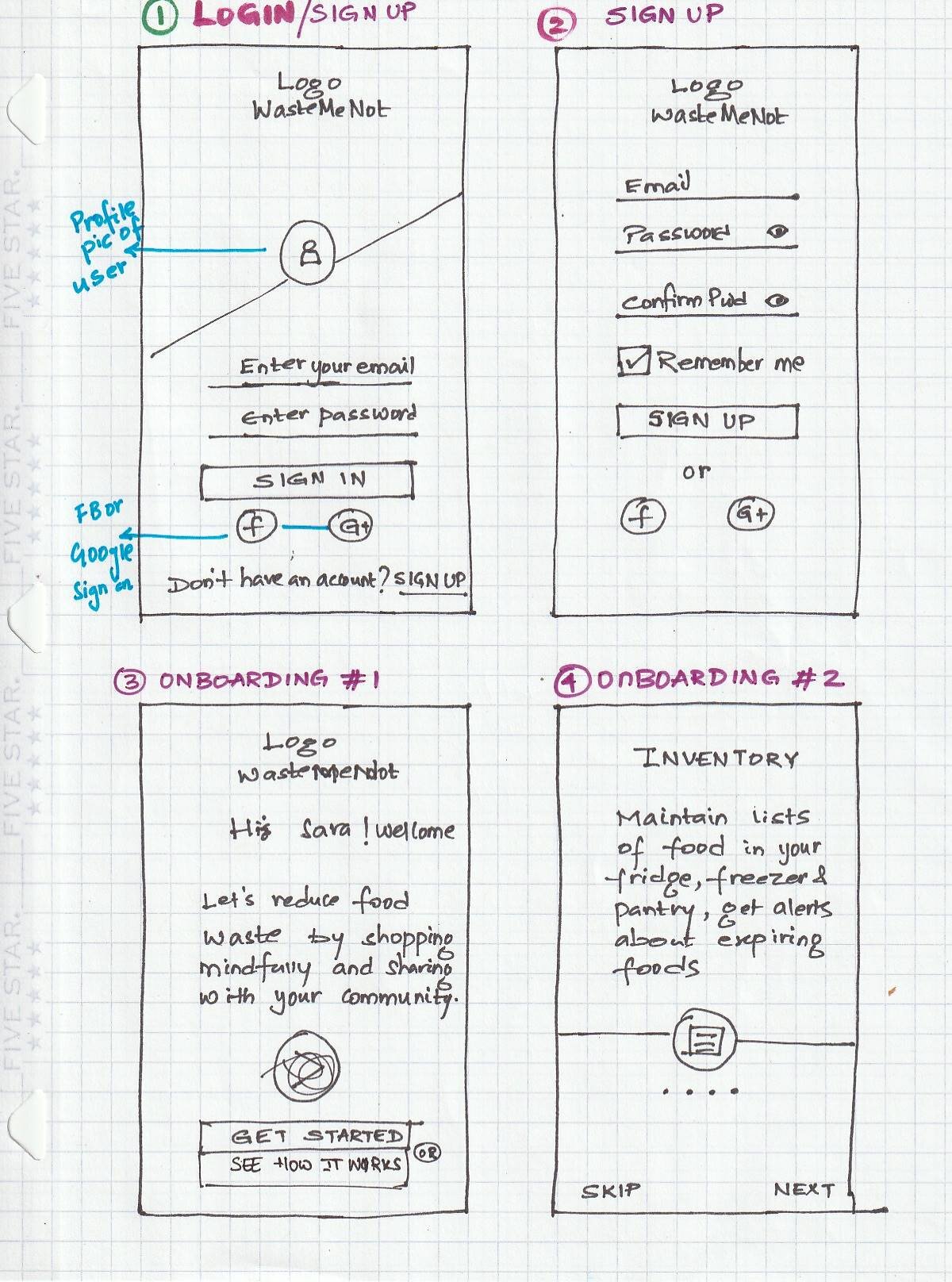
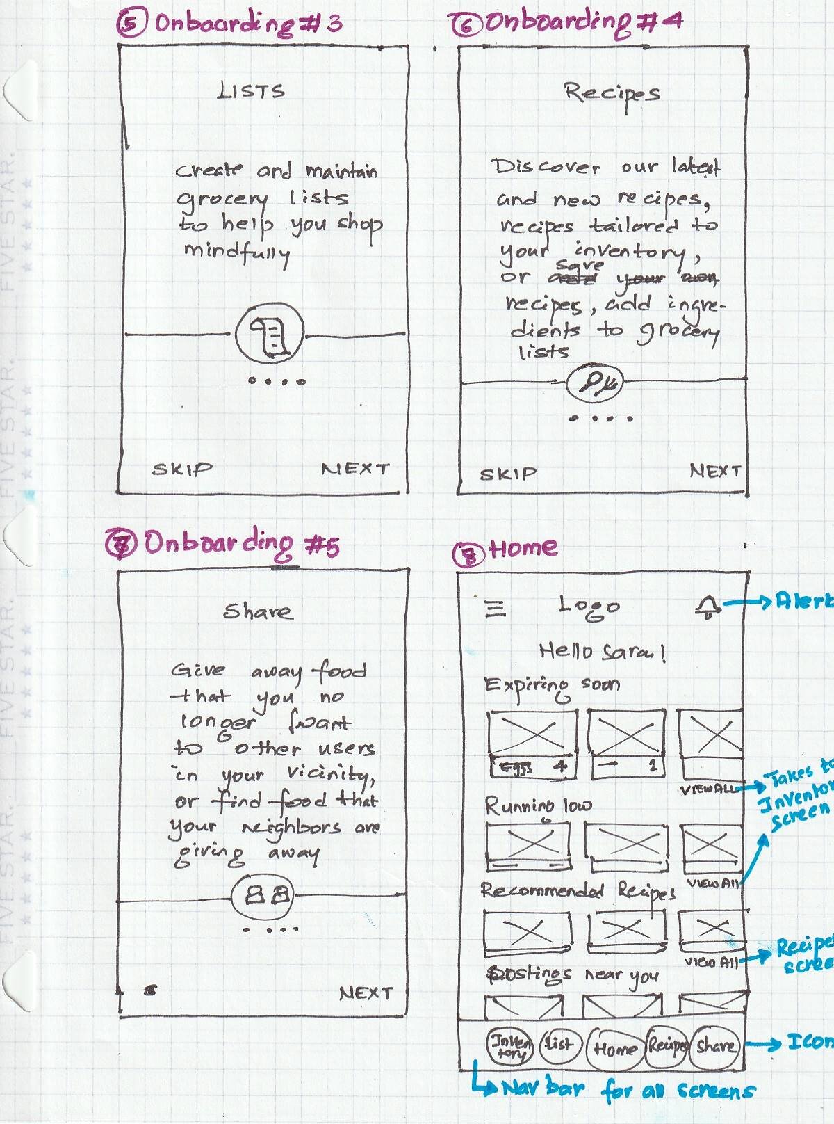
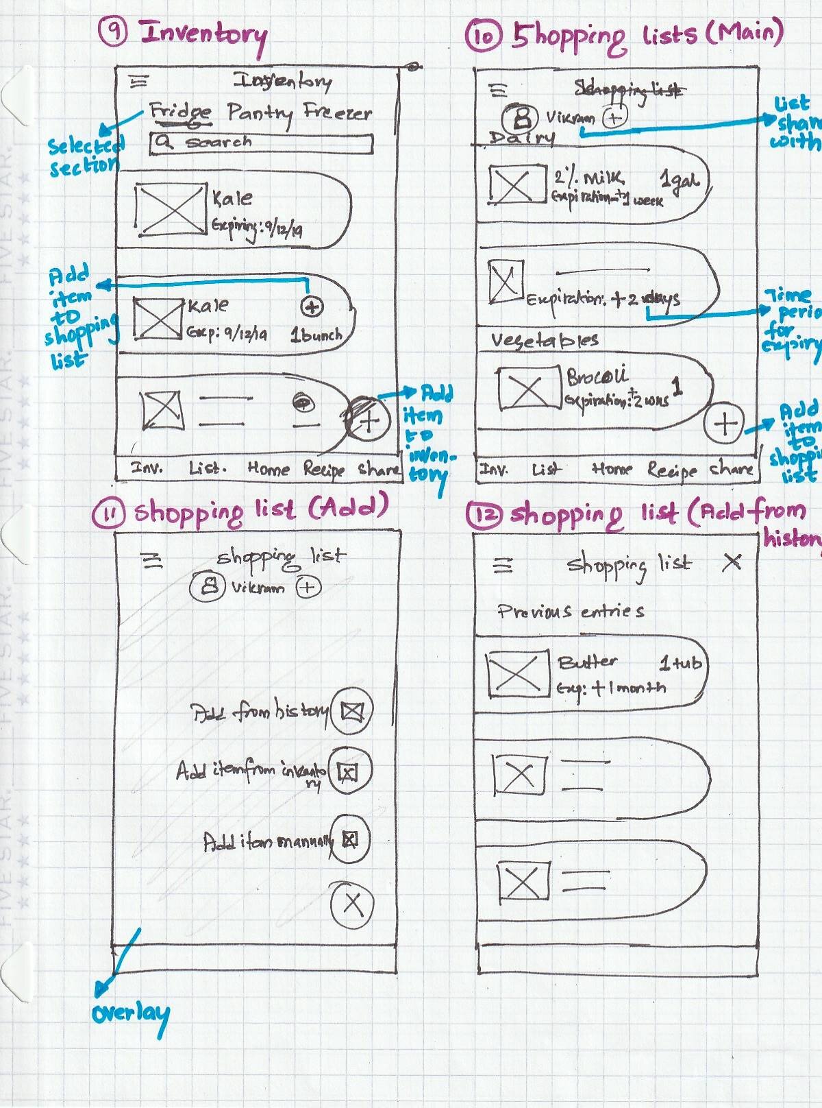
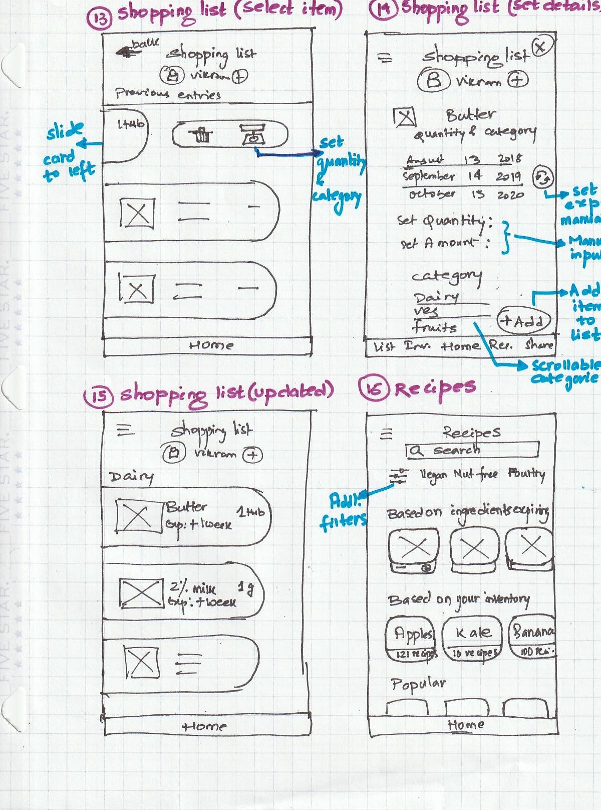
Sketching
I made some sketches to display content, structure and layout. I took inspiration from the existing apps and leveraged user’s familiarity with the design patterns allowing me to gain feedback early on in the process. It was challenging to decide how best to incorporate the features due to multiple actions the user needs to be able to perform on each screen.
Mid Fidelity Wireframes
Taking into account the feedback from my mentor and peers on the general flow and UI design of the app, I created mid-fidelity wireframes with text and image placeholders to focus on navigability and organization while adhering to Apple’s iOS Human Interface guidelines.
TEST & ITERATE
What do users think of the design?
I conducted a moderated usability testing with users who suit the archetype of a busy parent as my persona using a test plan. I gave them specific tasks to perform and observed their actions, ease of use, their struggles and subsequent questions. The findings were synthesized using an affinity map. Overall, the design was found intuitive by 80% of the test subjects and they liked the fact that items were categorized. Some improvements were incorporated in the next iteration of the designs.
How do we shape the user experience?
The visual design was developed by iterating from mood boards and style tiles to the UI kit and finally to creating a first version of the style guide.This can be used for future screens or interactions to maintain consistency and increase efficiency. More detailed UI Kit can be viewed here
Style guide
Logo
As sustainability was the core mission, I decided to bring in an element of nature/earth into the logo and settled upon leaf/tree and used the letter “W” for easy recognizability.
Final designs with interactions
Finally, based off my mood board for the colors and imagery, I styled the high fidelity wireframes and prototyped. The interactions I chose to focus on are dictated by the users needs identified earlier in the process.
Onboarding Experience
User has the option of signing up or logging in using their email or 1-click options like Google, Facebook ID
Add item to Shopping list
Users can decide to add items to their Shopping list based on what is in their inventory. An item can be added manually by keying in the details, from the existing inventory( e.g, if stock is running low) or from a previous purchase. Adding details like quantity etc is optional.
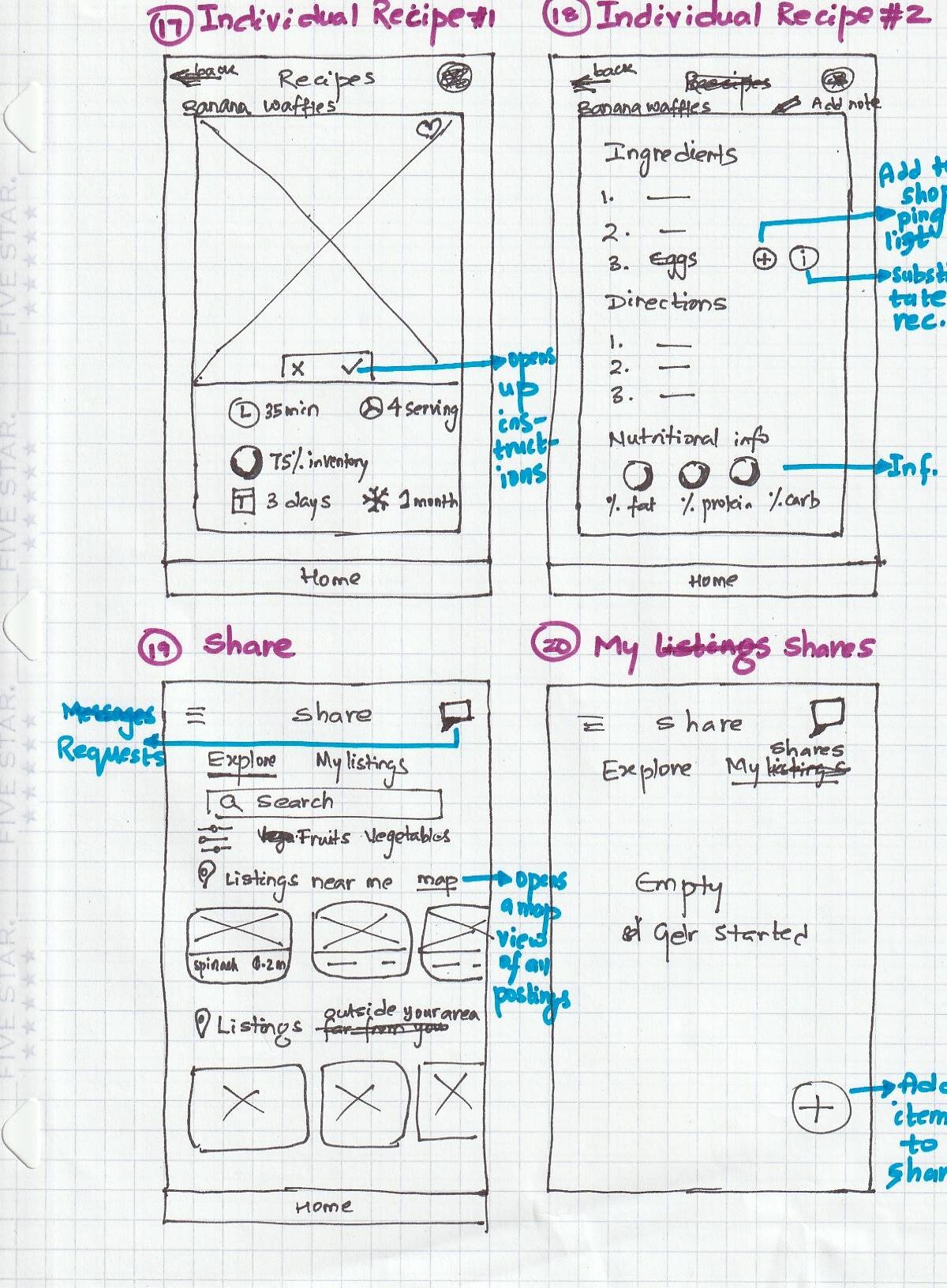
Finding recipes
User is recommended recipes based on ingredients in the inventory. The individual recipe also shows its shelf life and nutritional value. An item can be added to the shopping list right from this screen by clicking the “+” next to the ingredient name!
Managing the inventory
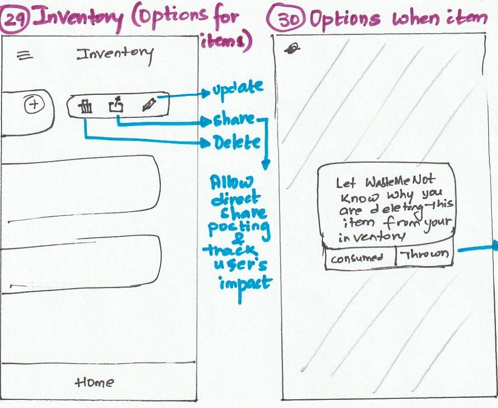
The inventory is categorized based on food storage location. It displays other useful information like days remaining for an item to expire and low stock. An item can be tagged to indicate why it is been deleted, which will be used by the app to gather stats.
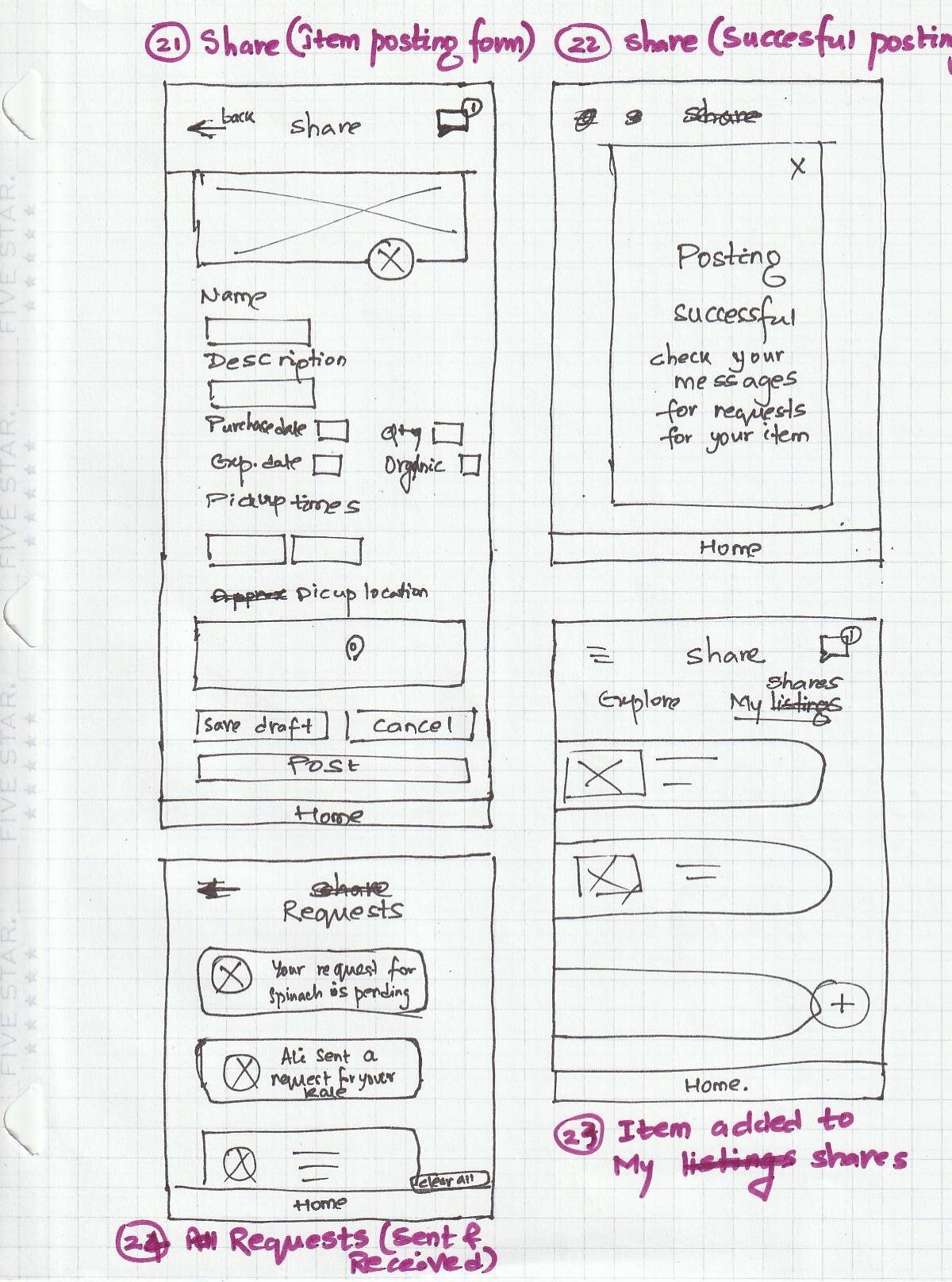
SHARE feature
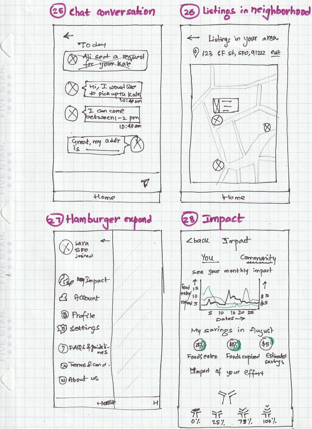
User need to enable location sharing while onboarding to allow the app recommend share groups near their community, which is vital to retain trust among users.
Impact
Users can view their food consumption trend via this chart on different days of the month. They also get the overall percentages and can compare between months.
REFLECTION
App design is challenging considering the number of factors to be evaluated - We need to consider which device the user is on, context they use the app, selecting the design patterns and interactions. How to ensure you find the right balance between utility of the app and the delight feature for the users? I started off with different interaction design in my sketches and after multiple iterations and countless lookups on Mobbin etc, settled on the current version.
Huge Feature list - My challenge was to prioritize the big list of features that I could design within the timeframe, at the same time to keep the features simple in their design and make them intuitive. I think it would certainly have helped me prioritize the features better if I, as a designer, could collaborate with the engineering team and understand the constraints better.
Visualization of data - It was tricky on how to develop the impact chart without it overwhelming the user. I realize this screen can be improved as there were more factors to be considered, like how to measure the foods consumed, how to explain and display the calculations summary in a friendly and positive manner for the app to work flawlessly
NEXT STEPS
Develop the onboarding screens for new users
Collaborate with engineers to handoff final mockups and discuss any technical considerations
Conduct further usability testing with hi-fidelity prototype and collect usability findings
Iterate on designs based on synthesized feedback and update UI kit accordingly